Here’s a terrible dialog I deal with on a regular basis.
I see it quite a bit, and it confuses me every time.
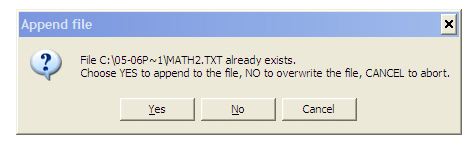
It’s part of the software that came with one of our Scantron OMR scanners. When you run forms through the scanner, the scanner sends a stream of comma-delimited data back to the software, which writes each line to disk as it arrives. Kind of a cool setup.
But when you’re re-scanning something, or appending to an existing scan job, this dialog comes up. I can’t for the life of me figure out why the buttons aren’t labeled Append to File, Overwrite File, and Cancel.
Sadly, this is somewhat typical of Windows applications (this is not an “I hate Windoze” remark; it’s just an observation I’ve made over the years). You really have to pay attention to the dialog to figure out what to do. Apple says that button captions should be actions (like Don’t Save, Delete, Modify, etc.), and I tend to agree. It makes the decision easier for the user.